• Skip to primary navigation
  • Skip to main content
  • Skip to primary sidebar
  • Skip to footer

PNHP

  • Home
  • Contact PNHP
  • Join PNHP
  • Donate
  • PNHP Store
  • About PNHP
    • Mission Statement
    • Local Chapters
    • Student chapters
    • Board of Directors
    • National Office Staff
    • Contact Us
    • Privacy Policy
  • About Single Payer
    • What is Single Payer?
    • How do we pay for it?
    • History of Health Reform
    • Conservative Case for Single Payer
    • FAQs
    • Información en EspaƱol
  • Take Action
    • The Medicare for All Act of 2025
    • Moral Injury and Distress
    • Medical Society Resolutions
    • Recruit Colleagues
    • Schedule a Grand Rounds
    • Letters to the Editor
    • Lobby Visits
  • Latest News
    • Sign up for e-alerts
    • Members in the news
    • Health Justice Monitor
    • Articles of Interest
    • Latest Research
    • For the Press
  • Reports & Proposals
    • Physicians’ Proposal
    • Medicare Advantage Equity Report
    • Medicaid Managed Care Report
    • Medicare Advantage Harms Report
    • Medicare Advantage Overpayments Report
    • Pharma Proposal
    • Kitchen Table Campaign
    • COVID-19 Response
  • Member Resources
    • 2025 Annual Meeting
    • Member Interest Groups (MIGs)
    • Speakers Bureau
    • Slideshows
    • Newsletter
    • Materials & Handouts
    • Webinars
    • Host a Screening
    • Events Calendar
    • Join or renew your membership

Articles of Interest

Why Does U.S. Health Care Cost So Much? (Part III: An Aging Population Isn't the Reason)

Share on FacebookShare on Twitter

By Uwe E. Reinhardt
New York Times
December 5, 2008

Graphs courtesy of Uwe Reinhardt.

Not a conference on health care goes by without someone’s asserting that the aging of our population is a major driver of the annual growth in health spending. It sounds intuitively appealing if one contemplates the following two graphs, which are regularly trotted out on such occasions.

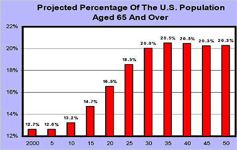
The first graph depicts what is commonly described as the “Baby Boom Tsunami.” The second depicts age-specific health spending per capita in 1999, relative to the spending of Americans in the age group 35 to 44, which is set to 1. These age-specific relative spending profiles do not change much over time for a given country, and they do not much differ among industrialized nations. They show that after age 60 or so, health spending per capita rises sharply with age.

Yet, research around the world has shown that the process of the aging of the population by itself adds only a very small part — usually about half a percentage point — to the annual growth in per-capita health spending in industrialized societies, which tends to range between 5 and 8 percent, depending on the country and the period in question. The bulk of annual spending growth can be explained by overall population growth (about 1.1 percent per year), increases in the prices of health care goods and services, and the availability of ever more new, often high-cost medical products and treatments used by all age groups.

Because this proposition is so counterintuitive, readers may wish to consult two recent research papers on the topic, one penned by the present author, and the other penned by other researchers.

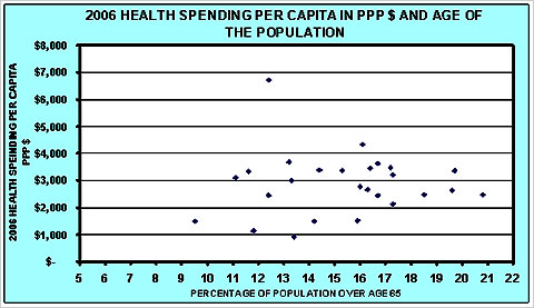
These papers are based on American data. Similar studies have appeared also for Canada, Australia and many other countries in the Organization for Economic Cooperation and Development. Indeed, it may surprise readers that knowing the percentage of a nation’s population that is over age 65 cannot help one explain cross-national differences in health spending per capita, as is shown in the graph further on. As the graph shows, the per-capita health spending of nations is virtually independent of the age structure of its population.

Why, then, is the aging of the population such a small driver of annual increases in health spending? The answer can be found in the last graphical display of this commentary. That graph contains the same data as the first graph in this commentary, but the vertical axis is scaled as it should be scaled: from 0 percent to 100 percent. Letting it run from 12 percent to 22 percent stretches the vertical axis and creates the image of the famous Baby Boom Tsunami. It is a form of lying with statistics.

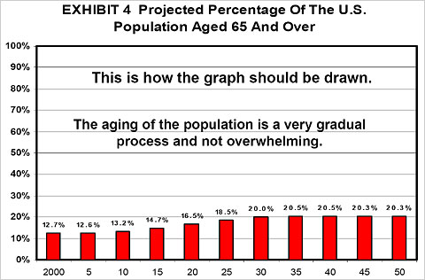
As this graph illustrates, the aging of our population is a very gradual process and does not come even close to resembling a tsunami. It is at best a demographic ripple.

Furthermore, current population projections have the fraction of elderly in the United States population peak at around 20 percent. Along with Canada and Australia, we shall be for a very long time the youngest nation in the O.E.C.D. Only in 2025 will the American population be as “old” as many European populations are already today.

As the song goes, relative to other nations we shall be “forever young”!


Uwe E. Reinhardt is an economist at Princeton.

http://economix.blogs.nytimes.com/2008/12/05/why-does-us-health-care-cost-so-much-part-iii-an-aging-population-isnt-the-reason/

Primary Sidebar

Recent Articles of Interest

  • Universal Healthcare Will Save Lives...and Could Save the Democratic Party
  • Medicare for All Explained Podcast: Episode 128
  • Medicare for All Explained Podcast: Episode 127
  • Medicare Will Require Prior Approval for Certain Procedures
  • Trump’s Big Bill Will Make It Harder for Doctors to Give Patients the Care They Need
  • About PNHP
    • Mission Statement
    • Local Chapters
    • Student chapters
    • Board of Directors
    • National Office Staff
    • Contact Us
    • Privacy Policy
  • About Single Payer
    • What is Single Payer?
    • How do we pay for it?
    • History of Health Reform
    • Conservative Case for Single Payer
    • FAQs
    • Información en EspaƱol
  • Take Action
    • The Medicare for All Act of 2025
    • Moral Injury and Distress
    • Medical Society Resolutions
    • Recruit Colleagues
    • Schedule a Grand Rounds
    • Letters to the Editor
    • Lobby Visits
  • Latest News
    • Sign up for e-alerts
    • Members in the news
    • Health Justice Monitor
    • Articles of Interest
    • Latest Research
    • For the Press
  • Reports & Proposals
    • Physicians’ Proposal
    • Medicare Advantage Equity Report
    • Medicaid Managed Care Report
    • Medicare Advantage Harms Report
    • Medicare Advantage Overpayments Report
    • Pharma Proposal
    • Kitchen Table Campaign
    • COVID-19 Response
  • Member Resources
    • 2025 Annual Meeting
    • Member Interest Groups (MIGs)
    • Speakers Bureau
    • Slideshows
    • Newsletter
    • Materials & Handouts
    • Webinars
    • Host a Screening
    • Events Calendar
    • Join or renew your membership

Footer

  • About PNHP
    • Mission Statement
    • Local Chapters
    • Student chapters
    • Board of Directors
    • National Office Staff
    • Contact Us
    • Privacy Policy
  • About Single Payer
    • What is Single Payer?
    • How do we pay for it?
    • History of Health Reform
    • Conservative Case for Single Payer
    • FAQs
    • Información en EspaƱol
  • Take Action
    • The Medicare for All Act of 2025
    • Moral Injury and Distress
    • Medical Society Resolutions
    • Recruit Colleagues
    • Schedule a Grand Rounds
    • Letters to the Editor
    • Lobby Visits
  • Latest News
    • Sign up for e-alerts
    • Members in the news
    • Health Justice Monitor
    • Articles of Interest
    • Latest Research
    • For the Press
  • Reports & Proposals
    • Physicians’ Proposal
    • Medicare Advantage Equity Report
    • Medicaid Managed Care Report
    • Medicare Advantage Harms Report
    • Medicare Advantage Overpayments Report
    • Pharma Proposal
    • Kitchen Table Campaign
    • COVID-19 Response
  • Member Resources
    • 2025 Annual Meeting
    • Member Interest Groups (MIGs)
    • Speakers Bureau
    • Slideshows
    • Newsletter
    • Materials & Handouts
    • Webinars
    • Host a Screening
    • Events Calendar
    • Join or renew your membership
©2025 PNHP